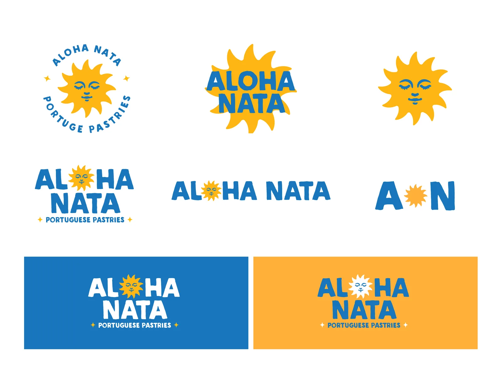
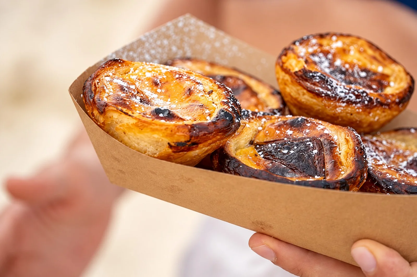
Aloha Nata sells pastéis de nata in Hawaii. The name explains the business in two words, and the identity had to do the same in one mark: a Portuguese custard tart, a long way from Lisbon, and entirely at home.
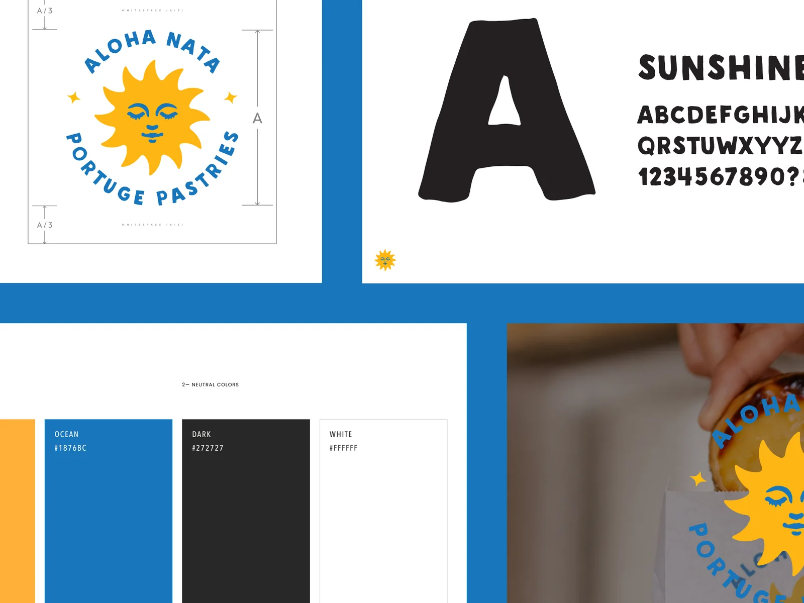
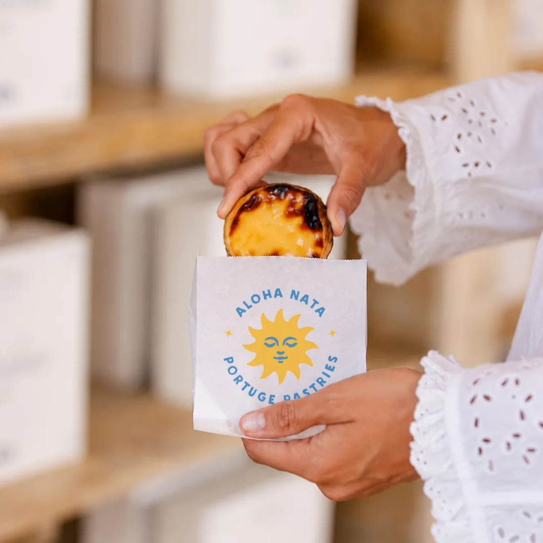
The mark is a sun with a face, which is also what a nata looks like coming out of the oven — blistered and caramelised across the top. One drawing carries both halves of the story, which is the whole reason it holds. The palette is named for the same two things: Sun and Ocean.
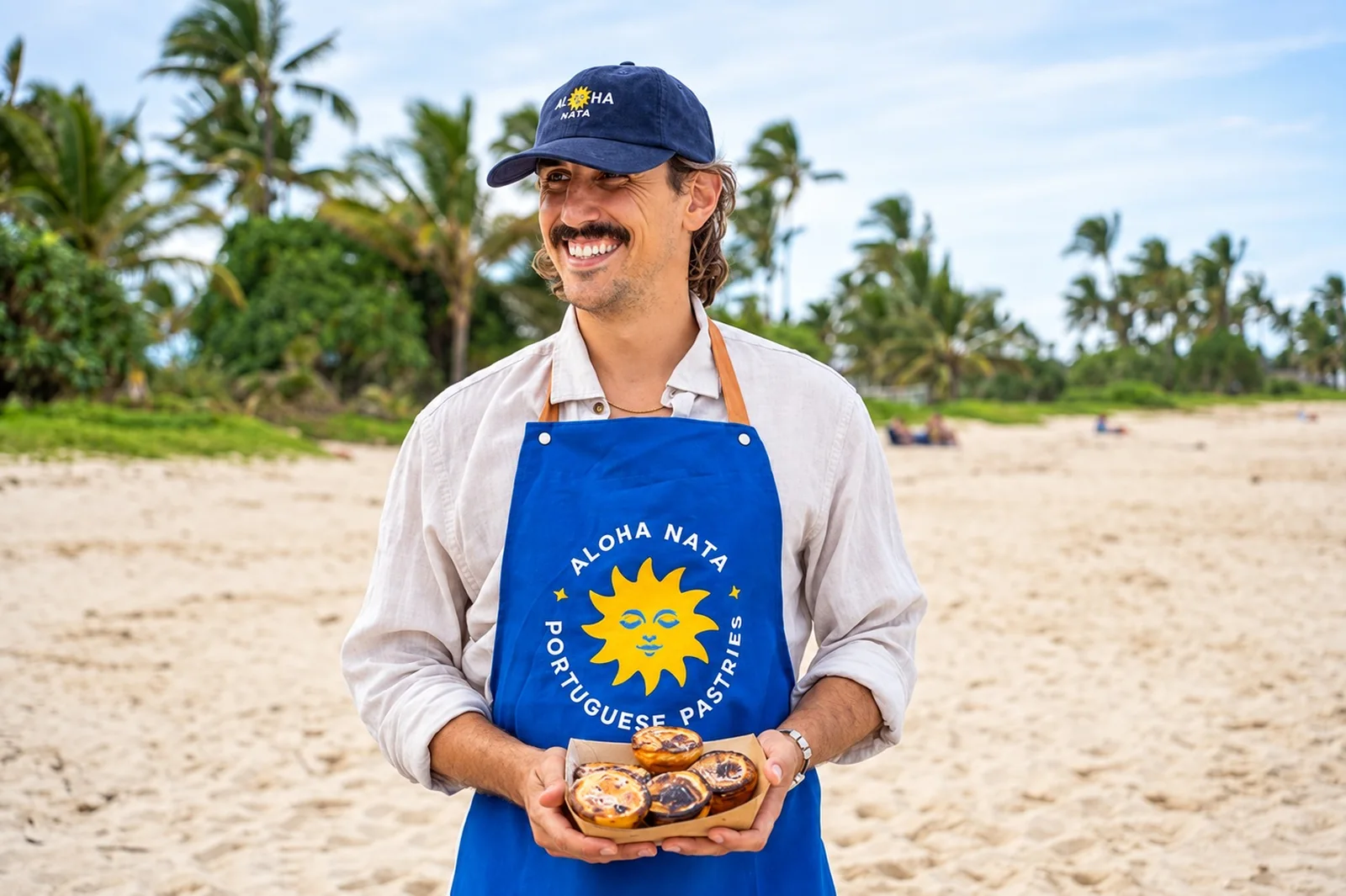
None of this was designed for a brochure. The brand lives on an apron, a cap, a bucket hat and a banner strung between two poles at a market — the surfaces a business actually has when it sells on a beach. Those are the pieces that had to carry the identity, so those are the pieces it was drawn for.